
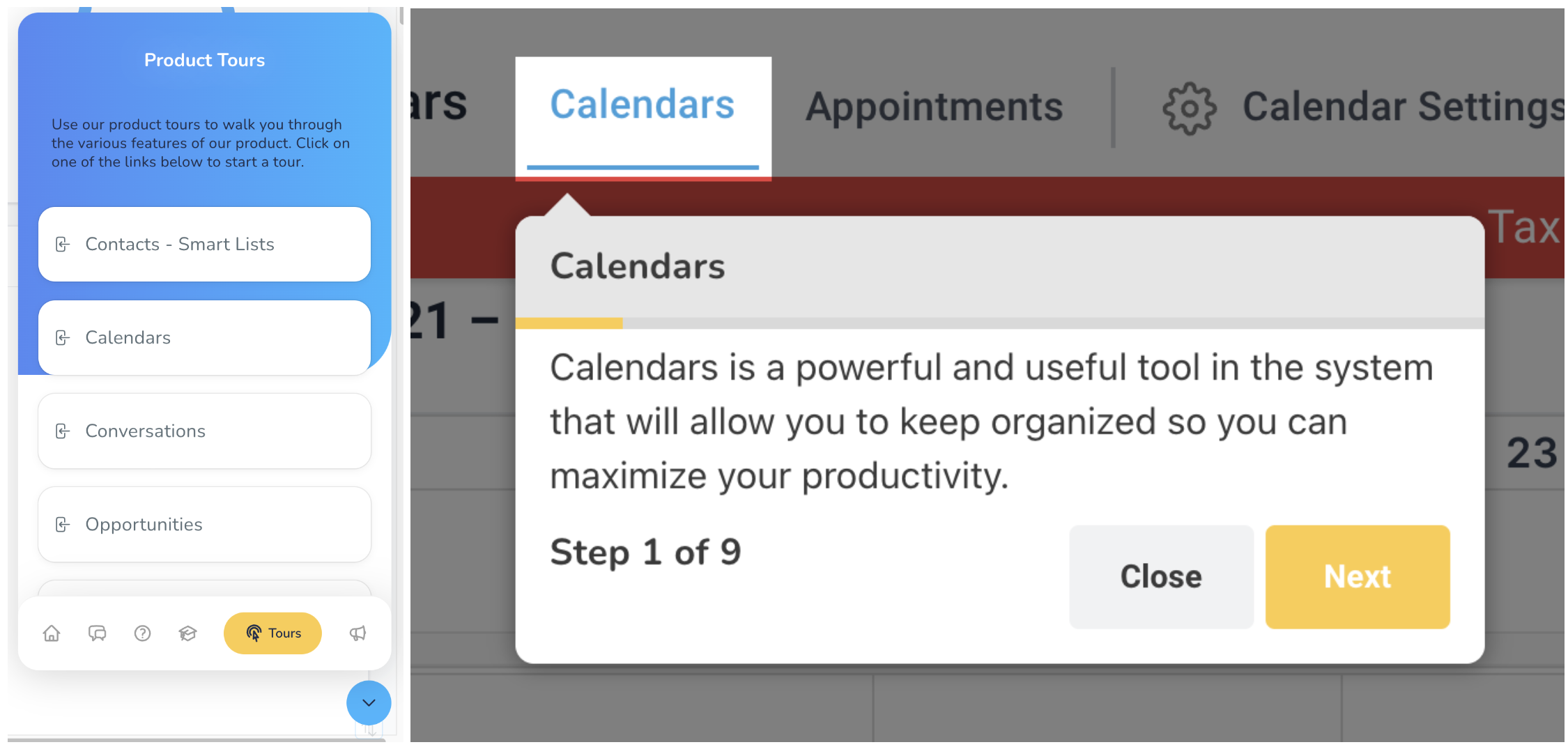
Welcome to this lesson on your User Guide feature in the Support OS system!
User Guides are essential tools for familiarizing users with the app's various features.
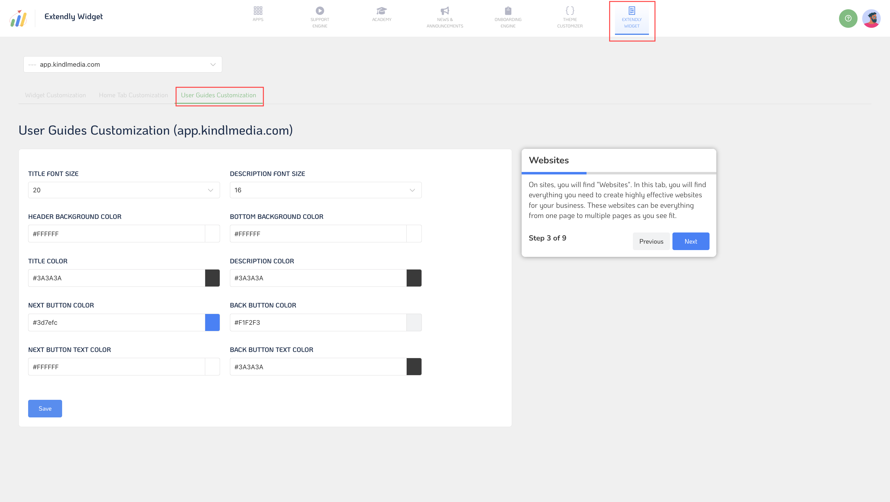
Within the User Guides customization settings, you can control various aspects of the guides' appearance and functionality.
- Title Font Size: Adjust the font size of user guide titles for optimal presentation.
- Description Font Size: Set the font size of user guide descriptions to provide clear instructions.
- Header Background Color: Choose the background color for user guide headers to distinguish them from other content.
- Bottom Background Color: Define the background color for the bottom section of user guides for visual appeal.
- Title Color: Customize the color of user guide titles for better visibility and branding.
- Description Color: Define the color of user guide descriptions to enhance readability.
- Next Button Color: Choose the "Next" button color within user guides for intuitive navigation.
- Back Button Color: Set the color of the "Back" button within user guides for a seamless user experience.
- Next Button Text Color: Customize the text color of the "Next" button for clear visibility.
- Back Button Text Color: Define the text color of the "Back" button to ensure readability.
- Save: Save your user guide customization settings to implement them seamlessly.
- Show User Guide Tours Live: Preview user guide tours in real time to ensure they meet your expectations before deployment.
Once you've customized your user guides and tours to your liking, you can save your settings and make them live for users to access and benefit from in real time.