
Welcome to this lesson on your User Guide feature in the Support OS system!
User Guides are essential tools for familiarizing users with the app's various features.
Let's explore how they work and how you can customize them.
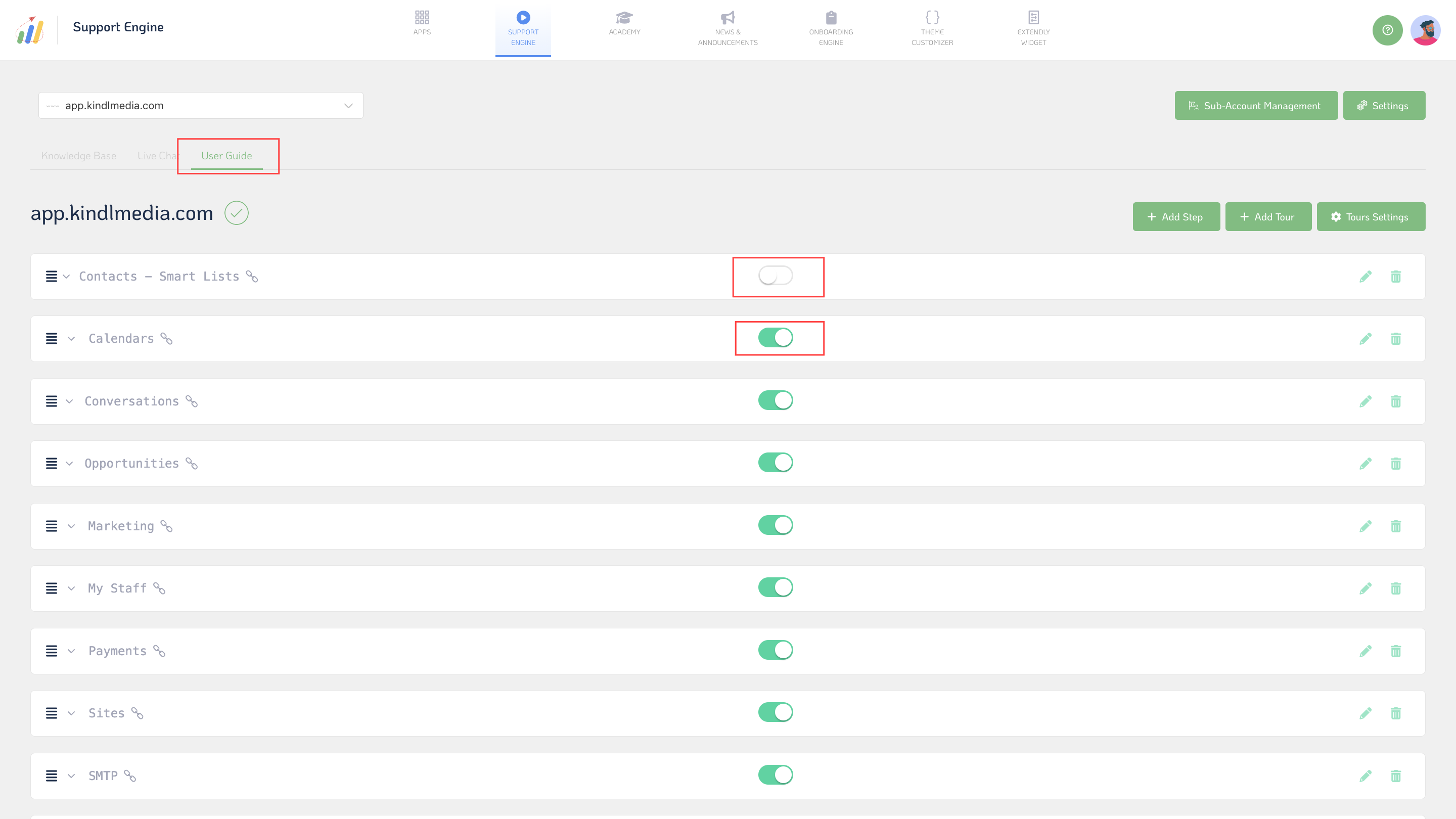
First, User Guides cover a range of features and functionalities within the app, providing step-by-step instructions for users. These guides come pre-made and offer comprehensive coverage of different app parts, ensuring users can easily navigate and utilize the app's capabilities. One standout feature is enabling or disabling specific categories or steps within the guides. This customization option allows you to tailor the guides to precisely match your users' needs.
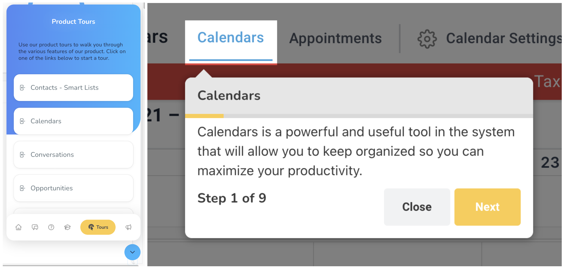
You can also add & edit your custom steps! Whether adding a new step to a premade user guide or starting from scratch, custom steps will help differentiate you from the competition. Each step in a tour can be configured with a title, target XPath (to identify the UI element), placement within the app interface, and content to be displayed.
- Step Title: The title or name given to a specific step within a tour or user guide. It provides a brief description or indication of the action or task the user should perform.
- Target XPath: The XPath expression is used to identify the specific UI element associated with the step. XPath is a query language for selecting nodes from an XML document, and in this context, it helps pinpoint the exact location of the user interface element within the application.
- Step Placement: Specifies where the step should appear within the application interface. It determines the visual positioning of the step relative to the UI element identified by the Target XPath.
- Tour: Refers to the overall sequence or series of steps that guide users through a particular process or workflow within the application. A tour typically consists of multiple steps, each designed to help users accomplish a specific task or goal.
- Content: The information or instructions provided to users within a step. This can include text, images, videos, or any other type of multimedia content that aids in explaining the task or action associated with the step.
- Save

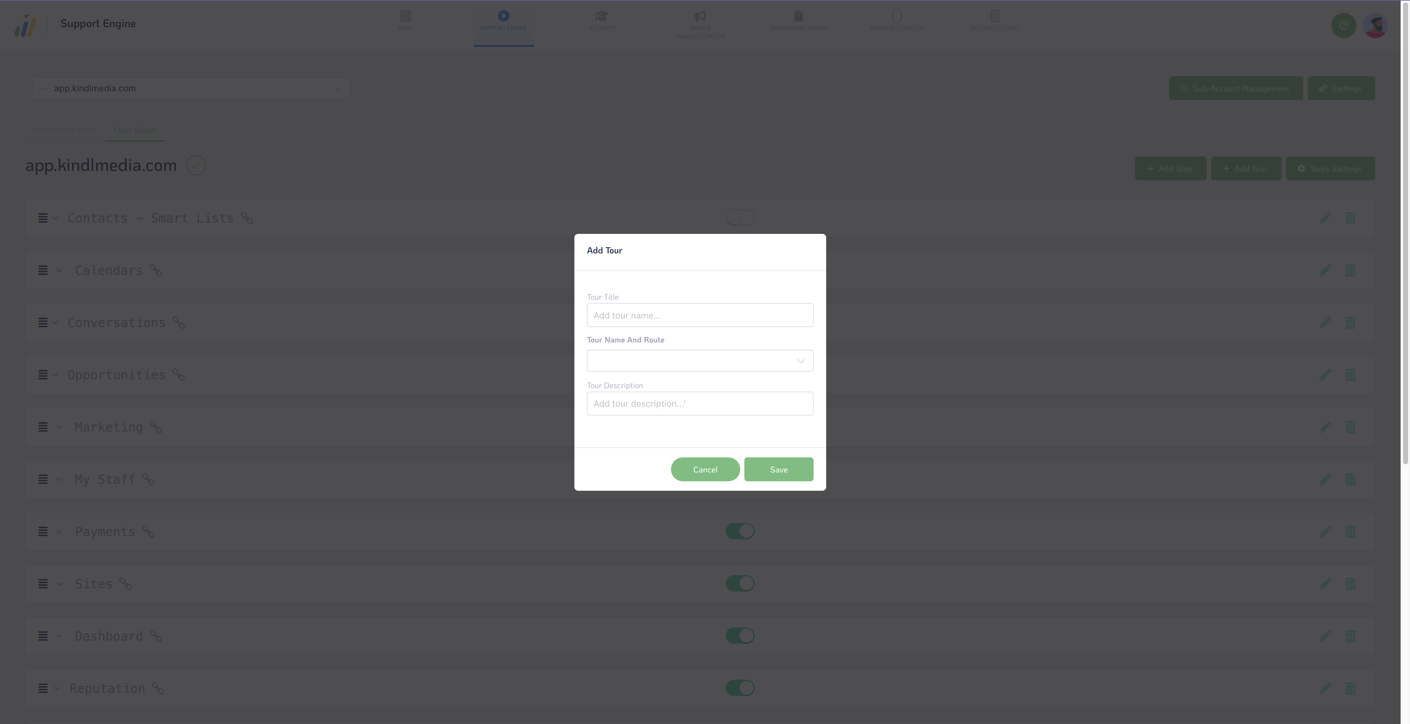
Furthermore, you can create and manage tours, giving them unique names, routes, and descriptions to provide additional context for users. You can create entire tours, which are sequences of steps guiding users through specific workflows or processes within the app.
- Tour Name: The title or name of a specific tour within the application. It serves as an identifier for the tour and provides users with a clear indication of its purpose or subject matter.
- Tour Name And Route: This field combines the tour name and associated route. The route refers to the sequence of steps or actions that users will follow during the tour. This field may display both the tour's name and its corresponding route to help users understand the context of the tour.
- Tour Description: A brief overview or explanation of the tour's objectives, contents, or intended audience. The description provides additional context for users and helps them understand the purpose and benefits of participating in the tour.
- Save
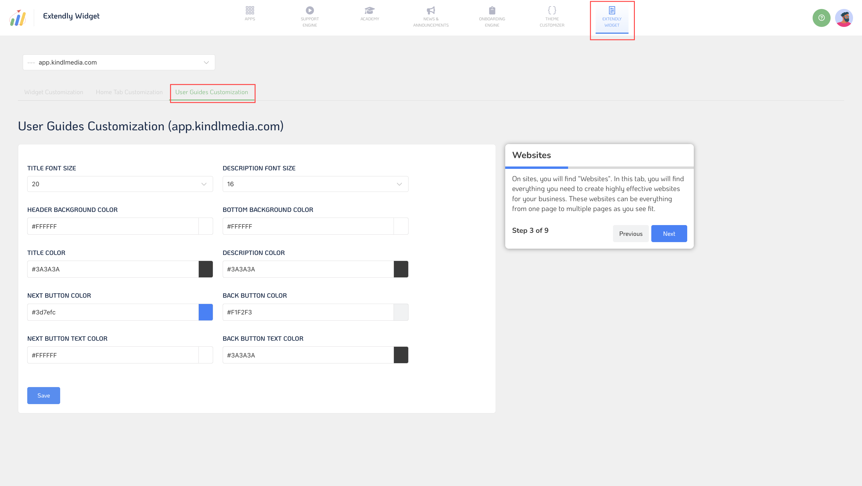
Within the User Guides customization settings, you can control various aspects of the guides' appearance and functionality.
- Title Font Size: Adjust the font size of user guide titles for optimal presentation.
- Description Font Size: Set the font size of user guide descriptions to provide clear instructions.
- Header Background Color: Choose the background color for user guide headers to distinguish them from other content.
- Bottom Background Color: Define the background color for the bottom section of user guides for visual appeal.
- Title Color: Customize the color of user guide titles for better visibility and branding.
- Description Color: Define the color of user guide descriptions to enhance readability.
- Next Button Color: Choose the "Next" button color within user guides for intuitive navigation.
- Back Button Color: Set the color of the "Back" button within user guides for a seamless user experience.
- Next Button Text Color: Customize the text color of the "Next" button for clear visibility.
- Back Button Text Color: Define the text color of the "Back" button to ensure readability.
- Save: Save your user guide customization settings to implement them seamlessly.
- Show User Guide Tours Live: Preview user guide tours in real time to ensure they meet your expectations before deployment.
Once you've customized your user guides and tours to your liking, you can save your settings and make them live for users to access and benefit from in real time.
In summary, User Guides offer comprehensive assistance for users, with the flexibility to customize and tailor their content and appearance to meet your specific requirements.