
With the Widget Customizer, you have complete control over the appearance and functionality of your support widget, allowing you to create a seamless and engaging user experience for your clients. With these settings, you can transform your support widget into a unique and impressive tool, tailored to meet your clients' needs perfectly.

Widget Customizer:
- Toggle On & Off: Easily enable or disable the support widget with a simple toggle switch.
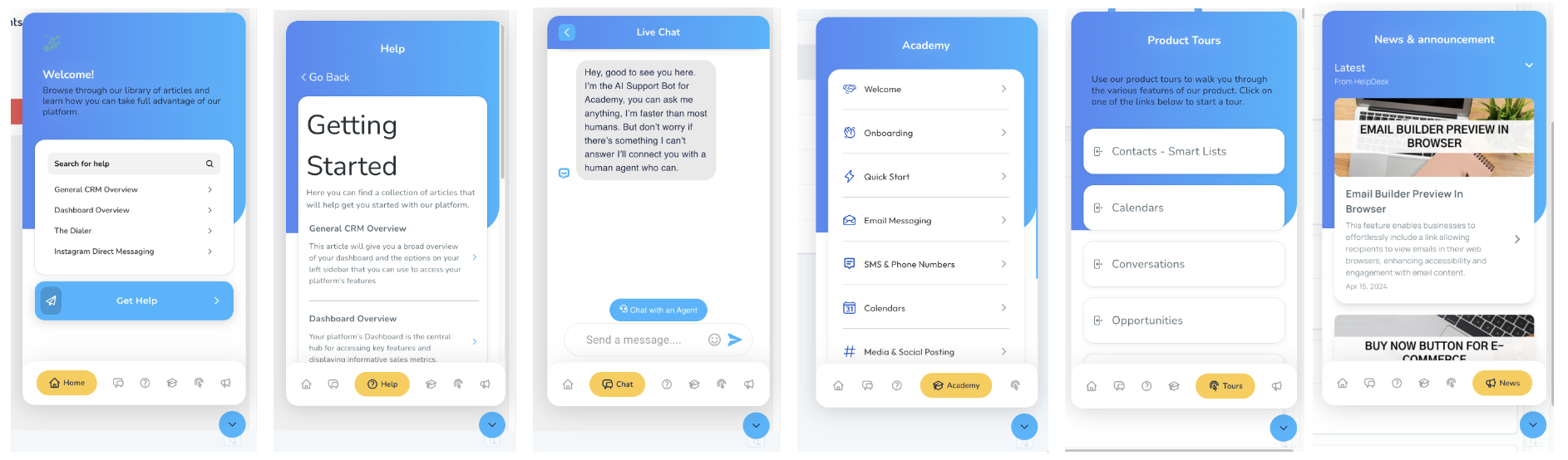
- Logo: Upload your company logo to display it prominently on the widget.
- Button Logo: Customize the logo on the widget's buttons for a cohesive branding experience.
- Title: Define the main title of the widget to grab users' attention effectively.
- Sub Title: Add a sub-title to provide additional context or information.
- Base Color: Choose the primary color scheme for the widget to match your brand's aesthetics.
- Secondary Color: Select a secondary color to complement the base color and enhance visual appeal.
- Title Size: Adjust the font size of the widget's title for optimal readability.
- Title Color: Customize the color of the widget's title text to align with your brand identity.
- Sub-Title Size: Set the sub-title's font size to ensure typography consistency.
- Sub-Title Color: Define the color of the sub-title text for better visual hierarchy.
- Menu Button Text Color: Customize the text color on menu buttons for clear visibility.
- Menu Button Background Color: Choose the background color of menu buttons to enhance contrast.
- Logo Background Color: Define the background color behind the company logo for a polished look.
- Widget Position: Decide where the support widget will be displayed on your website for maximum visibility.
- Save: Save your customized settings to apply them to the support widget instantly.
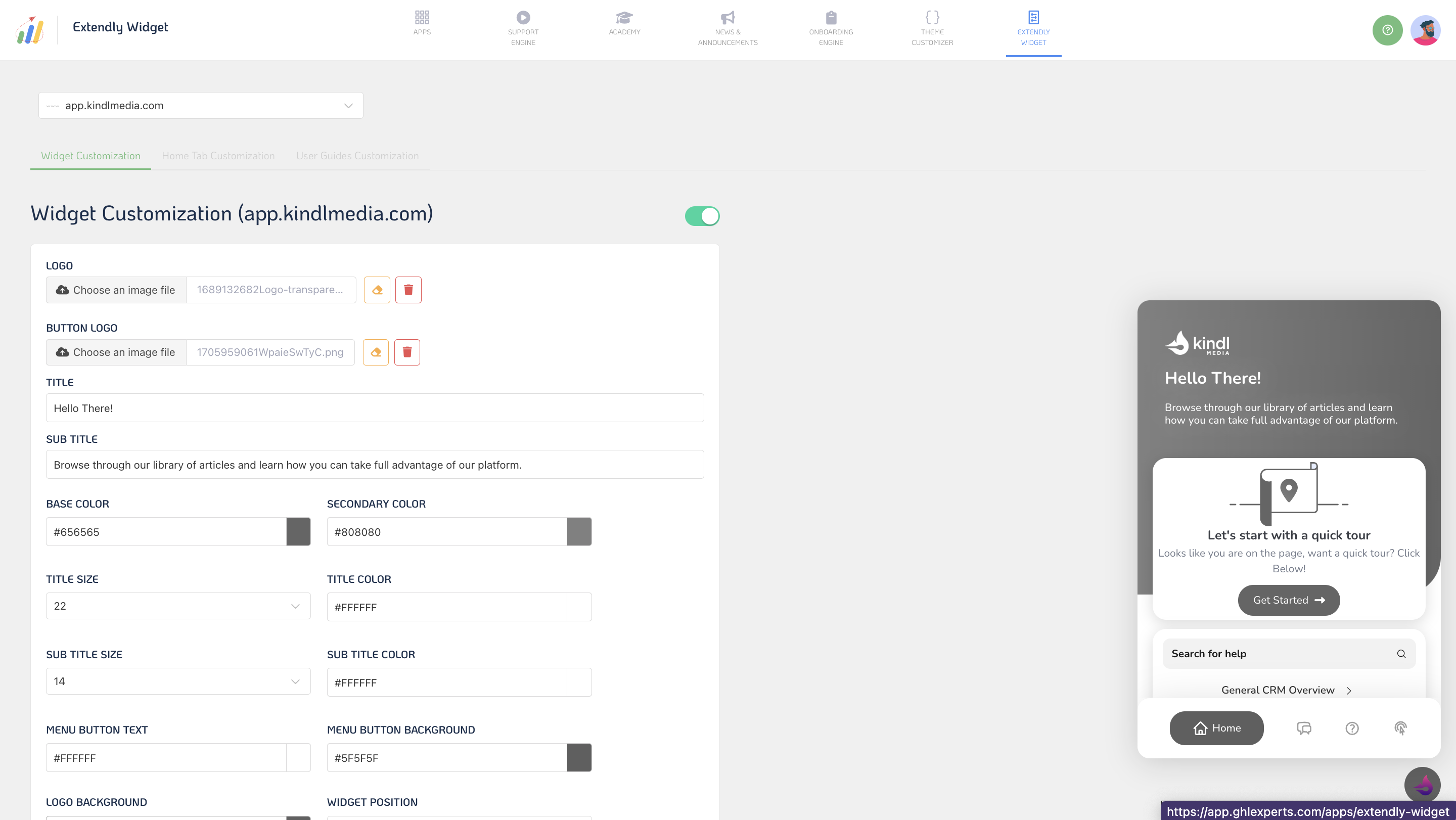
Home Tab Customization:
- Toggle Blocks On & Off: Enable or disable specific content blocks on the widget's home tab according to your preferences.
- Rearrange Blocks: Easily rearrange the order of content blocks to prioritize important information.
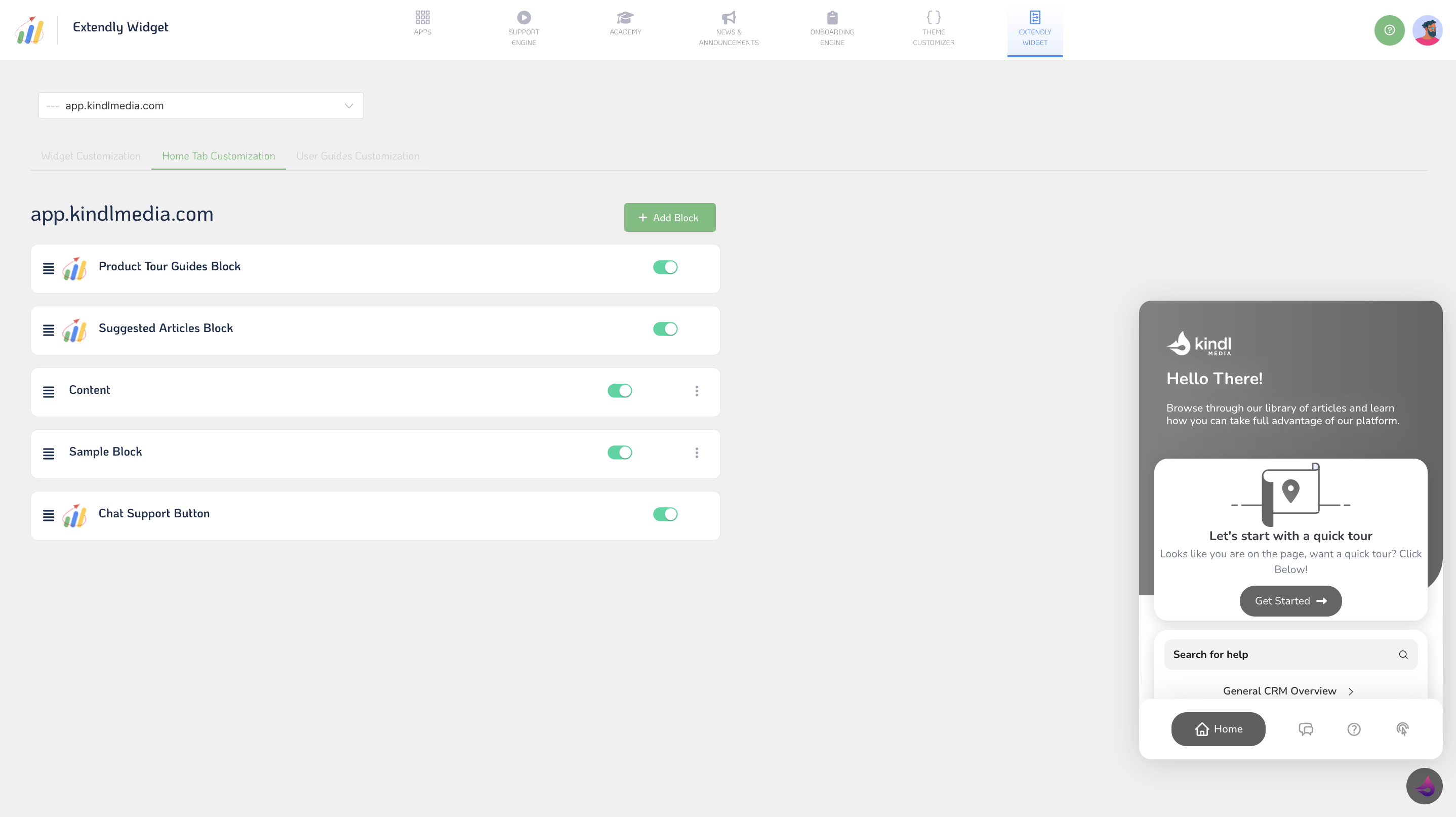
- Add Block: Include additional content blocks to provide users with relevant resources or announcements.
- Title: Specify the title of each content block for clarity and organization.
- Block Type: Choose the type of content block, such as text, image, or video, to convey information effectively.
- Content: Add compelling content to each block to engage users and address their needs.
- Block Background Color: Customize the background color of each content block for visual consistency.
- Block Title Text Color: Define the color of the text within each block's title for readability.
- Block Content Text Color: Set the color of the text within each block's content to ensure readability.
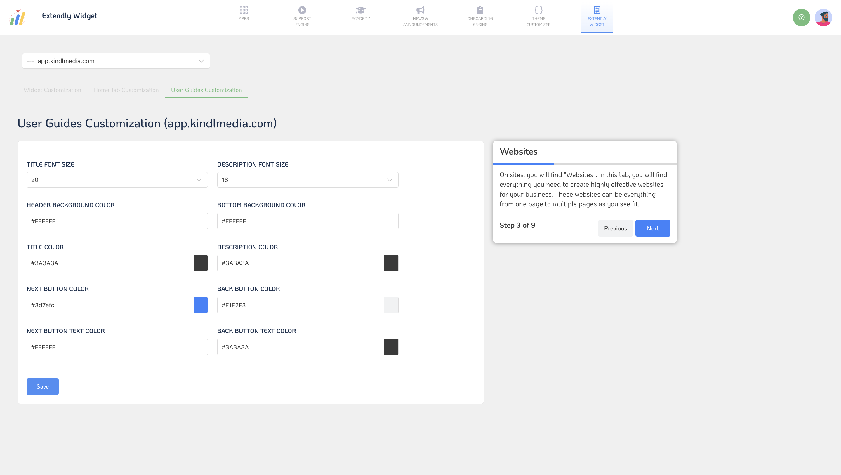
User Guides Customization:
- Title Font Size: Adjust the font size of user guide titles for optimal presentation.
- Description Font Size: Set the font size of user guide descriptions to provide clear instructions.
- Header Background Color: Choose the background color for user guide headers to distinguish them from other content.
- Bottom Background Color: Define the background color for the bottom section of user guides for visual appeal.
- Title Color: Customize the color of user guide titles for better visibility and branding.
- Description Color: Define the color of user guide descriptions to enhance readability.
- Next Button Color: Choose the "Next" button color within user guides for intuitive navigation.
- Back Button Color: Set the color of the "Back" button within user guides for a seamless user experience.
- Next Button Text Color: Customize the text color of the "Next" button for clear visibility.
- Back Button Text Color: Define the text color of the "Back" button to ensure readability.
- Save: Save your user guide customization settings to implement them seamlessly.
Don't settle for a generic widget that doesn't reflect your brand's personality and values. Instead, use these customization options to create a support widget that will make your clients feel valued and appreciated.